
OTP Sign-In — Light & Dark
A quick personal exploration, nothing too elaborate.
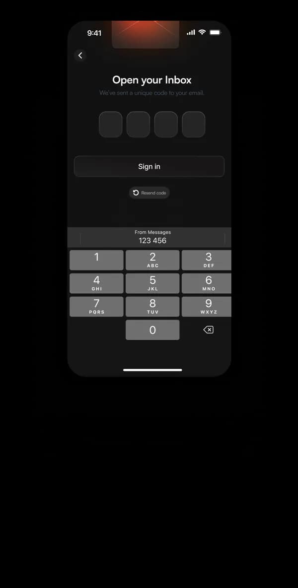
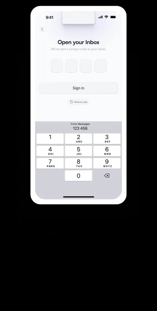
A simple OTP sign-in screen, designed once and tested across both light and dark themes.
The focus was consistency — same layout, spacing, and hierarchy, just re-skinned.
Clear numeric inputs and a native-style keypad keep the flow familiar and frictionless. Small touches, like the 'Resend code' link and native message preview, ground it in realism.
This one was less about solving a problem and more about staying sharp on the fundamentals.