
Layout Practice — Editorial Grid

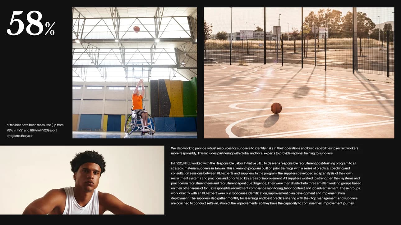
A layout exercise focused purely on editorial composition and grid discipline.
Real-world content (Nike's sustainability reporting) was used as a placeholder, letting me focus entirely on hierarchy, spacing, and image-to-text balance.
A bold stat leads the page, paired with strong photography to set immediate context. The asymmetric image grid breaks the rhythm without losing visual balance. Dense body copy is handled with generous line-height to stay readable at scale.
This exploration was about practicing restraint — letting content breathe, not decorate.