
OTP Sign-In — Take Two
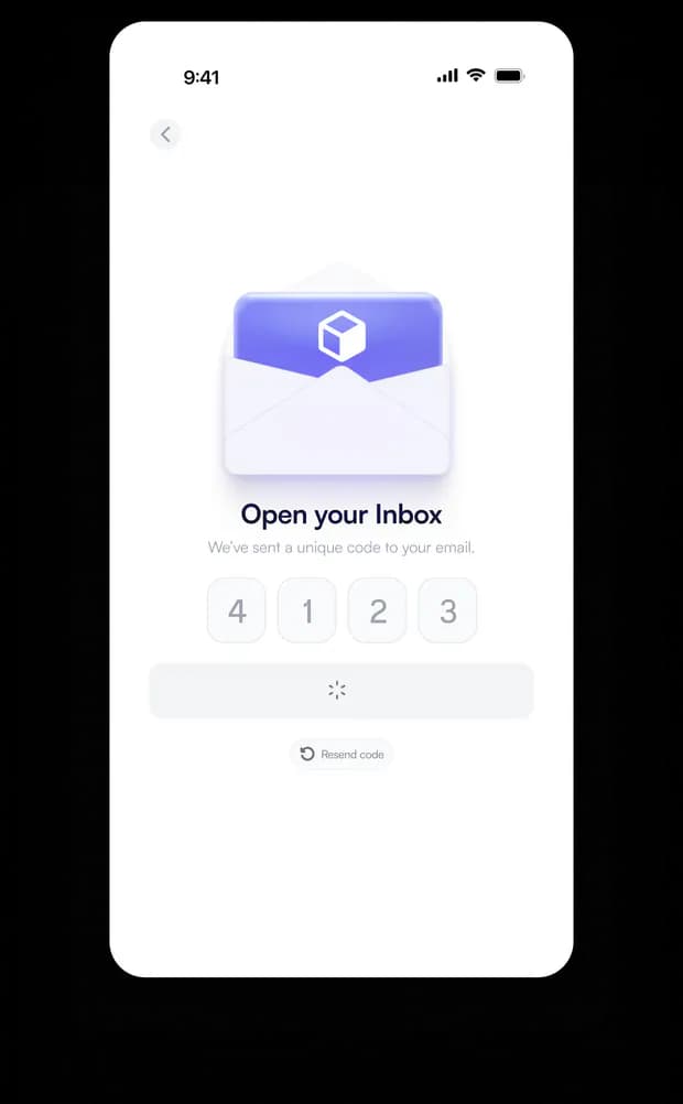
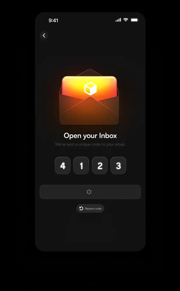
A second pass at the same OTP sign-in flow, this time with an illustrated focal point.
An envelope-and-package icon replaces the plain numeric layout, adding a bit more personality.
The gradient glow on dark mode gives it warmth, while the light version stays soft and neutral.
Same core structure as the first version — inbox prompt, code input, resend action — but the added illustration shifts the tone from purely functional to slightly more inviting.
Testing both themes side by side again to see which visual language felt more 'on brand.'
A small iteration, but useful for comparing plain UI versus illustration-led UI for the same flow.